A handcrafted tea with a real story had no visual identity to match it.
The market was already filled with premium-looking tea brands, making visual differentiation a challenge. Beyond creating attractive packaging, the brand needed a strong identity system that could make each blend feel unique while still belonging to one cohesive family. Multiple illustration styles, packaging explorations, and structural adjustments were required to ensure every detail felt intentional and refined.
Goal
Create a brand that looked as handmade and honest as the tea inside.
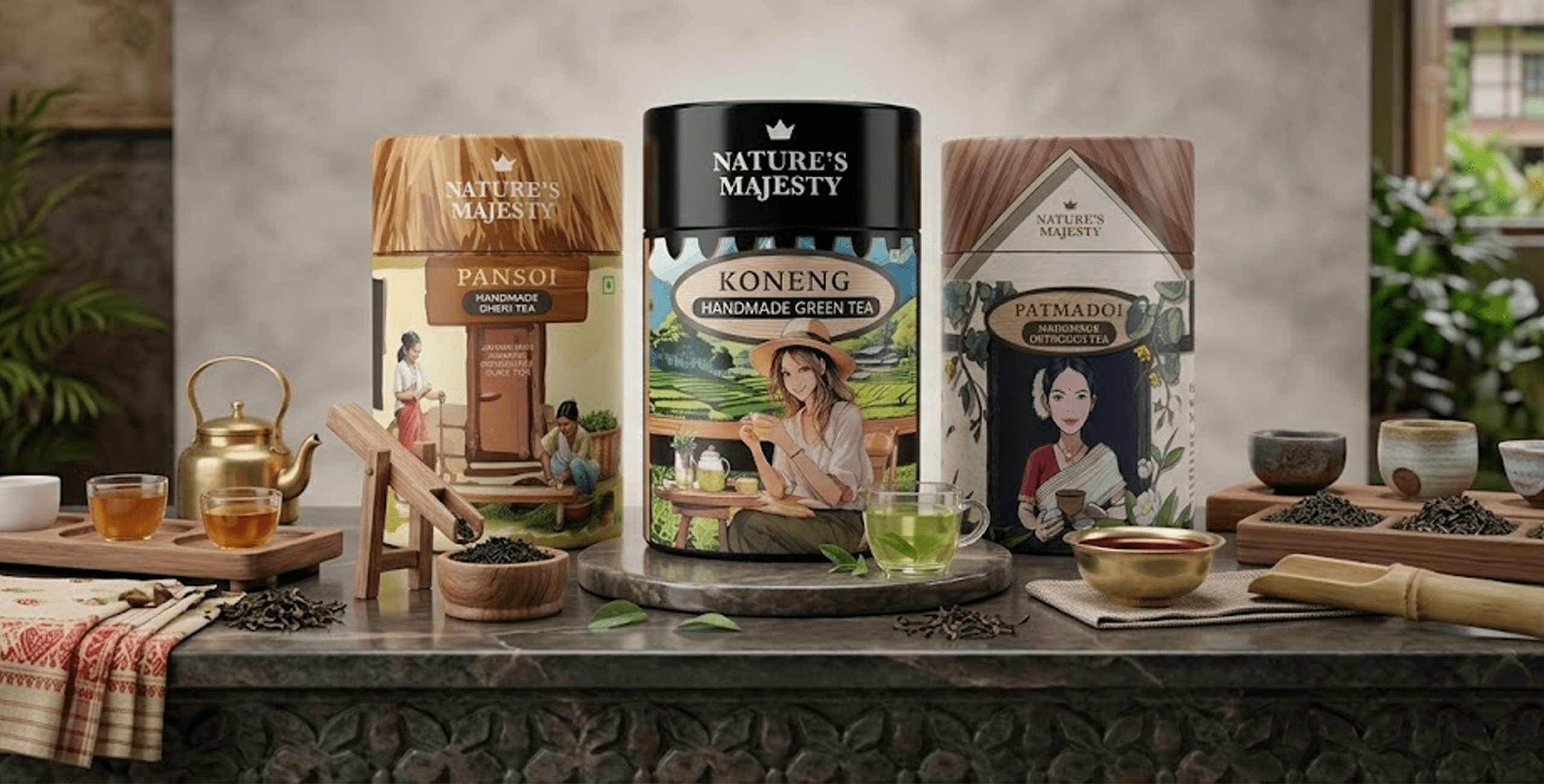
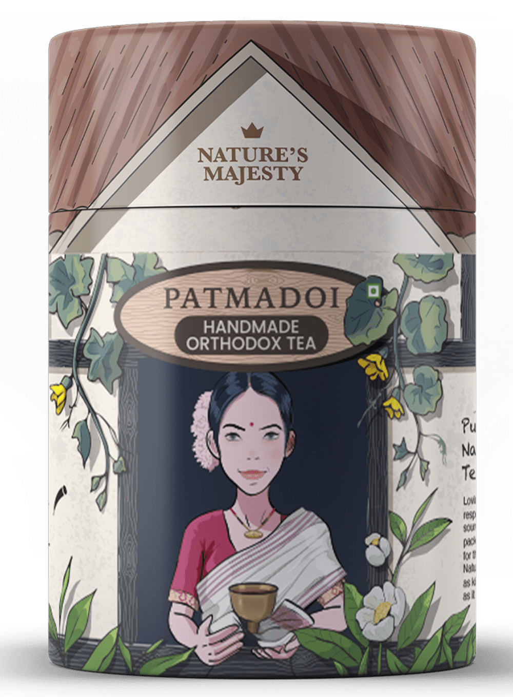
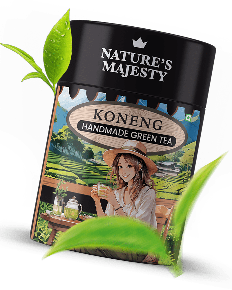
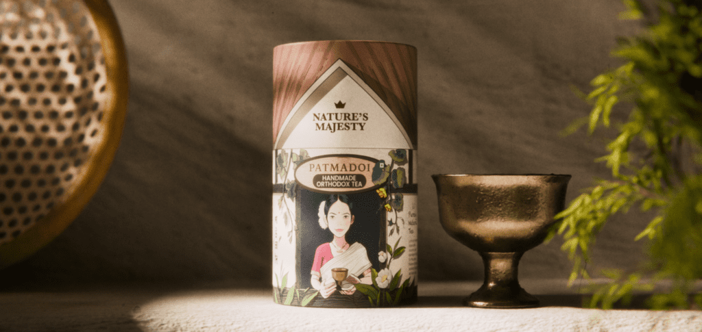
Each blend had its own character and that had to show. The goal was to develop a cohesive yet distinct visual identity across all four teas, with original illustrations that reflected the nature and mood of each blend. The packaging had to feel premium without losing warmth, and different enough to stop someone mid-aisle.
Result
A jar on the shelf that people had not seen before in the tea aisle, and could not ignore.
After multiple rounds of refinement across illustrations, layout, and jar dimensions, Nature’s Majesty arrived with a presence all its own. Each blend carries its own illustrated world while sitting clearly within one brand family. The jar format, the first of its kind in this space, gave the brand an immediate identity and a shelf presence that set it apart from every standard pouch and box around it.
Bringing back visitors to the world of craft beer! Such an exciting journey!
When authenticity is real, design simply helps the world notice it.