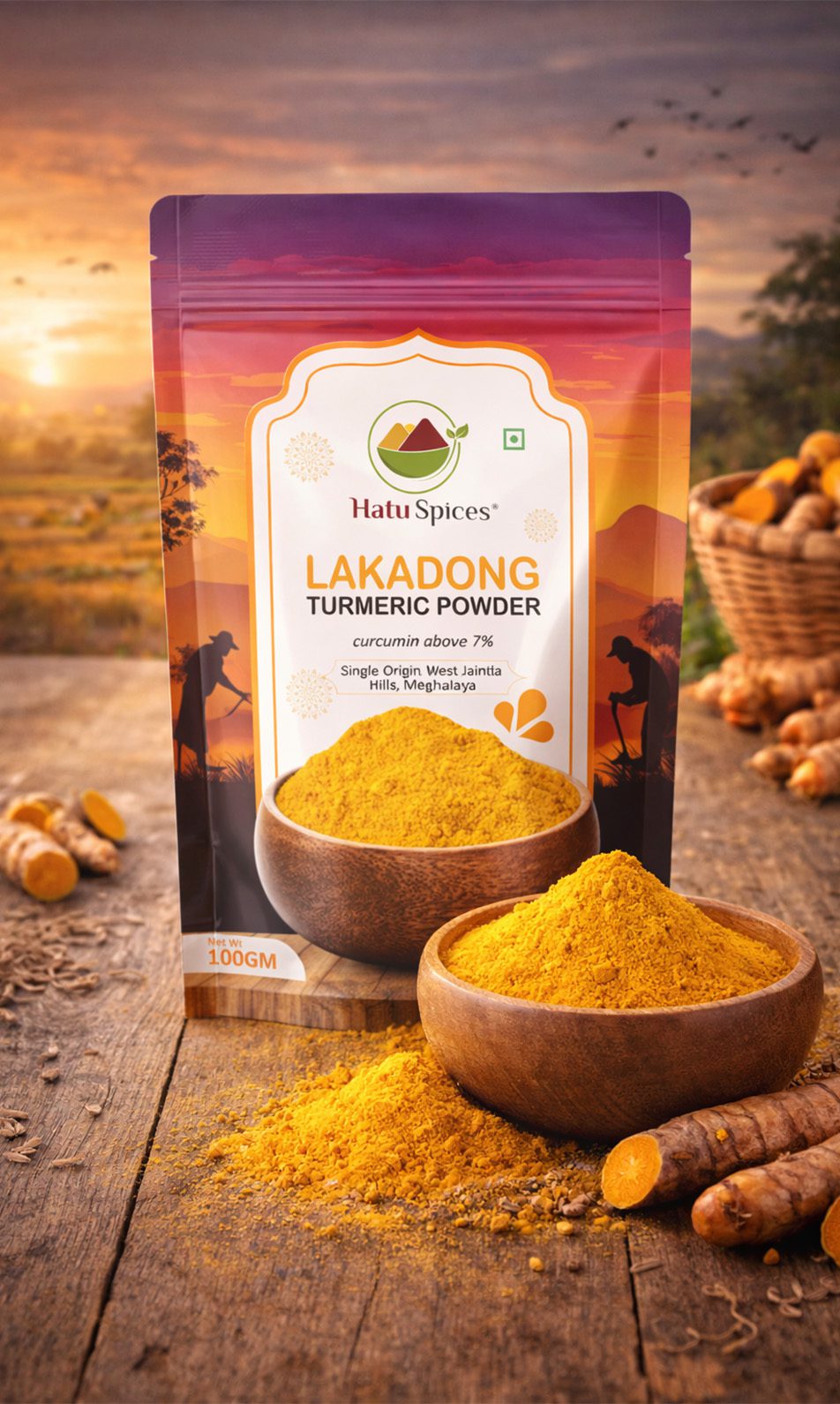
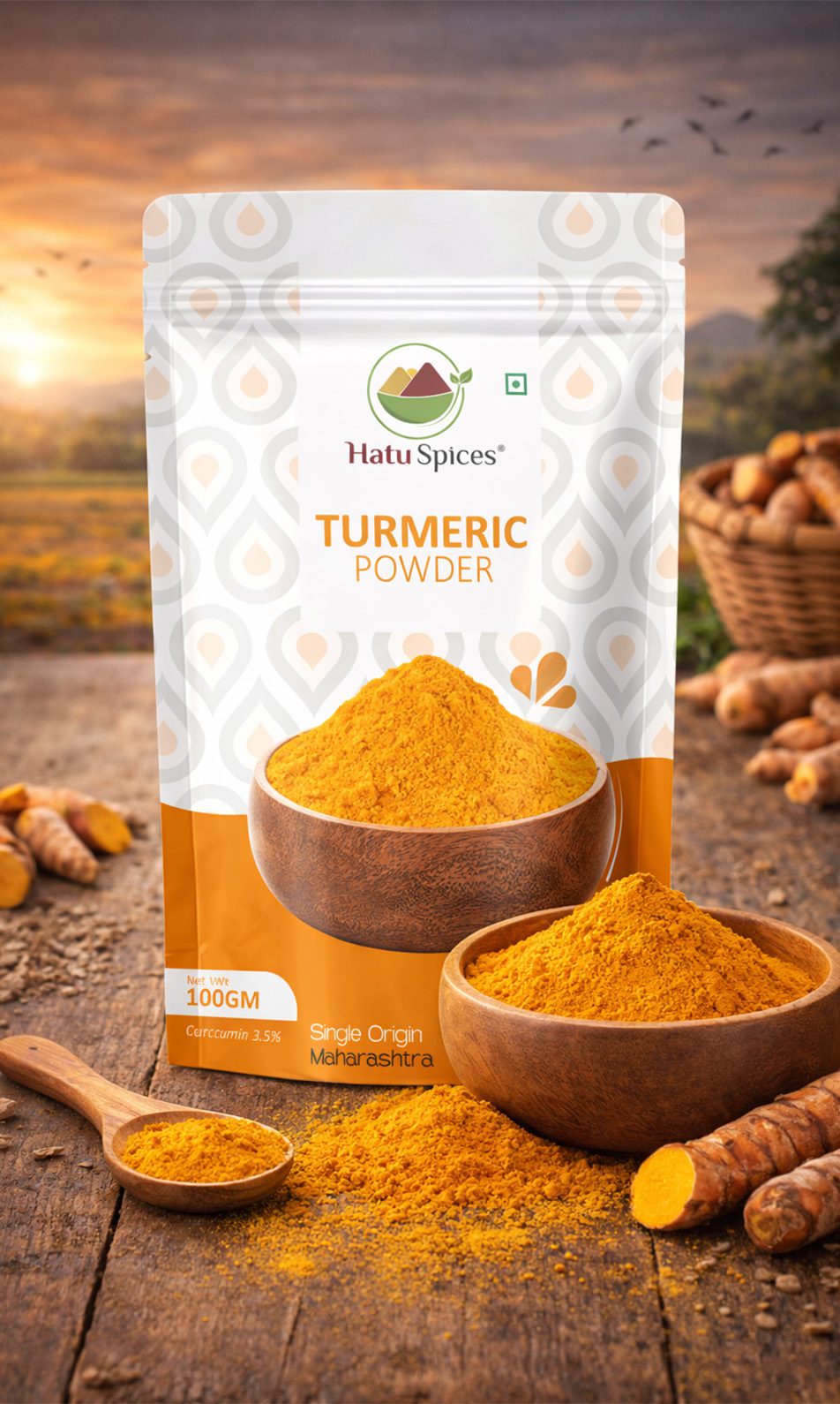
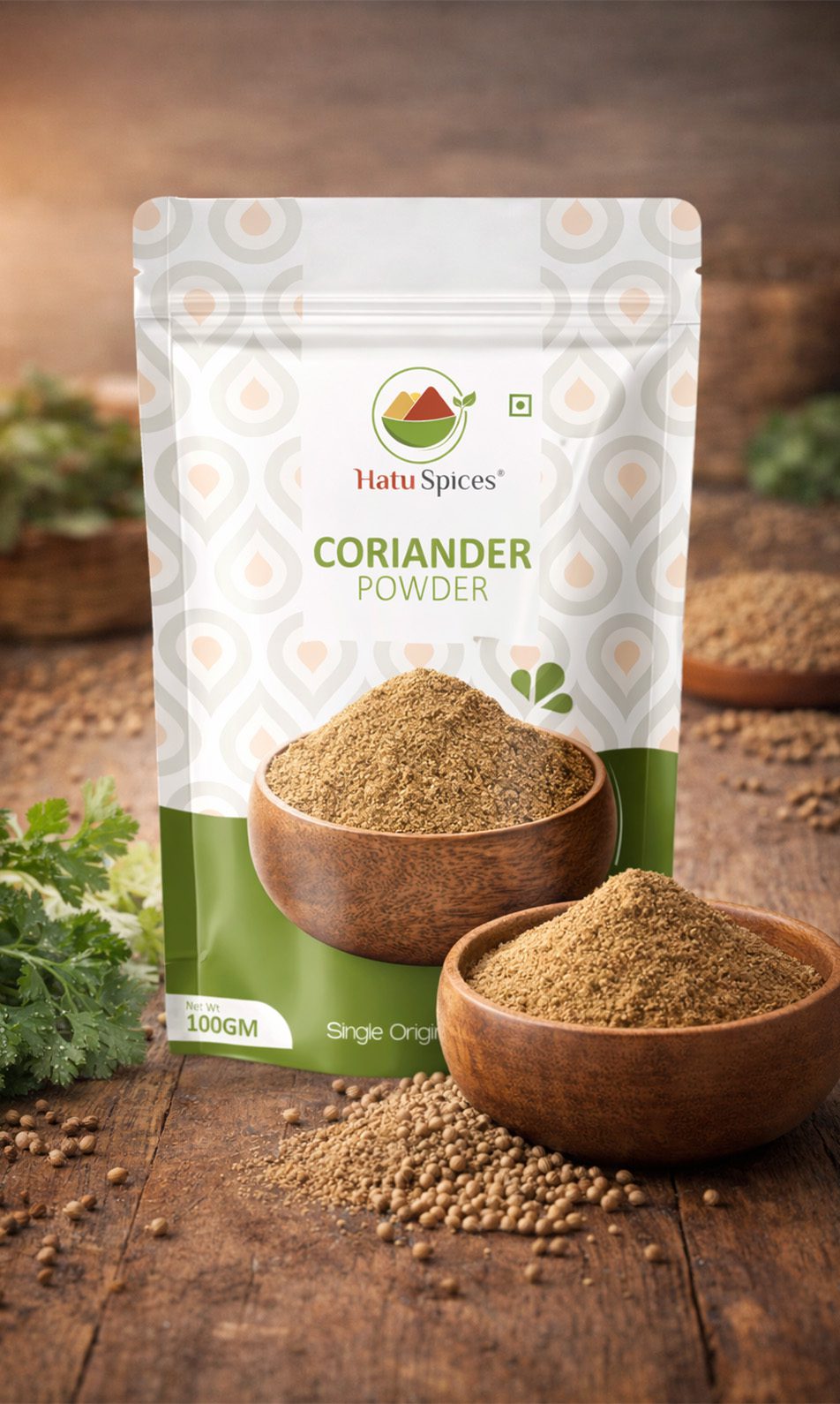
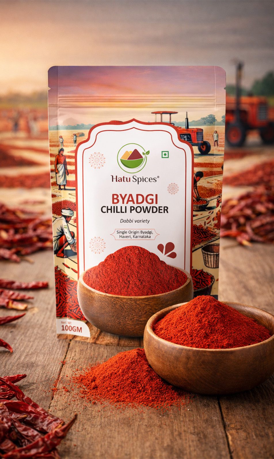
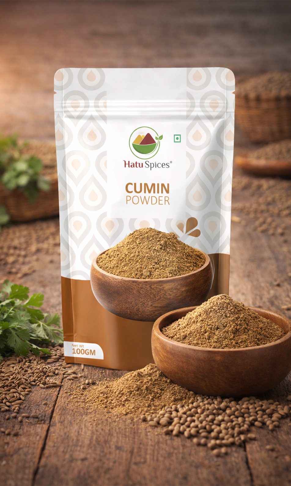
The Indian spice market is saturated. Standing out as genuinely premium, not just
premium-looking, meant competing with legacy brands while staying rooted in the Northeast's
cultural and agricultural identity.
In response to the dynamic shifts in their industry landscape and a desire to connect more effectively with a younger audience, our client recognized the imperative for a comprehensive brand refresh.
Driven by a commitment to remaining current, aligning with contemporary values, and resonating authentically with a dynamic audience, the refresh encompassed a holistic approach — from visual aesthetics and messaging to a profound reimagining of the overall brand experience.
Goal
Establish Hatu as a premium, export-worthy spice brand that resonates globally while
keeping the spirit of Northeast India at its heart through authentic visual storytelling.
Armed with insights, we meticulously refined their brand message for authenticity and resonance. Beyond words, we embarked on a creative journey, crafting a fresh visual identity that truly showcases their unique essence. This integrated approach, blending refined messaging and a captivating visual aesthetic, empowers our client to confidently communicate their values and engage their audience in a meaningful way.
Result
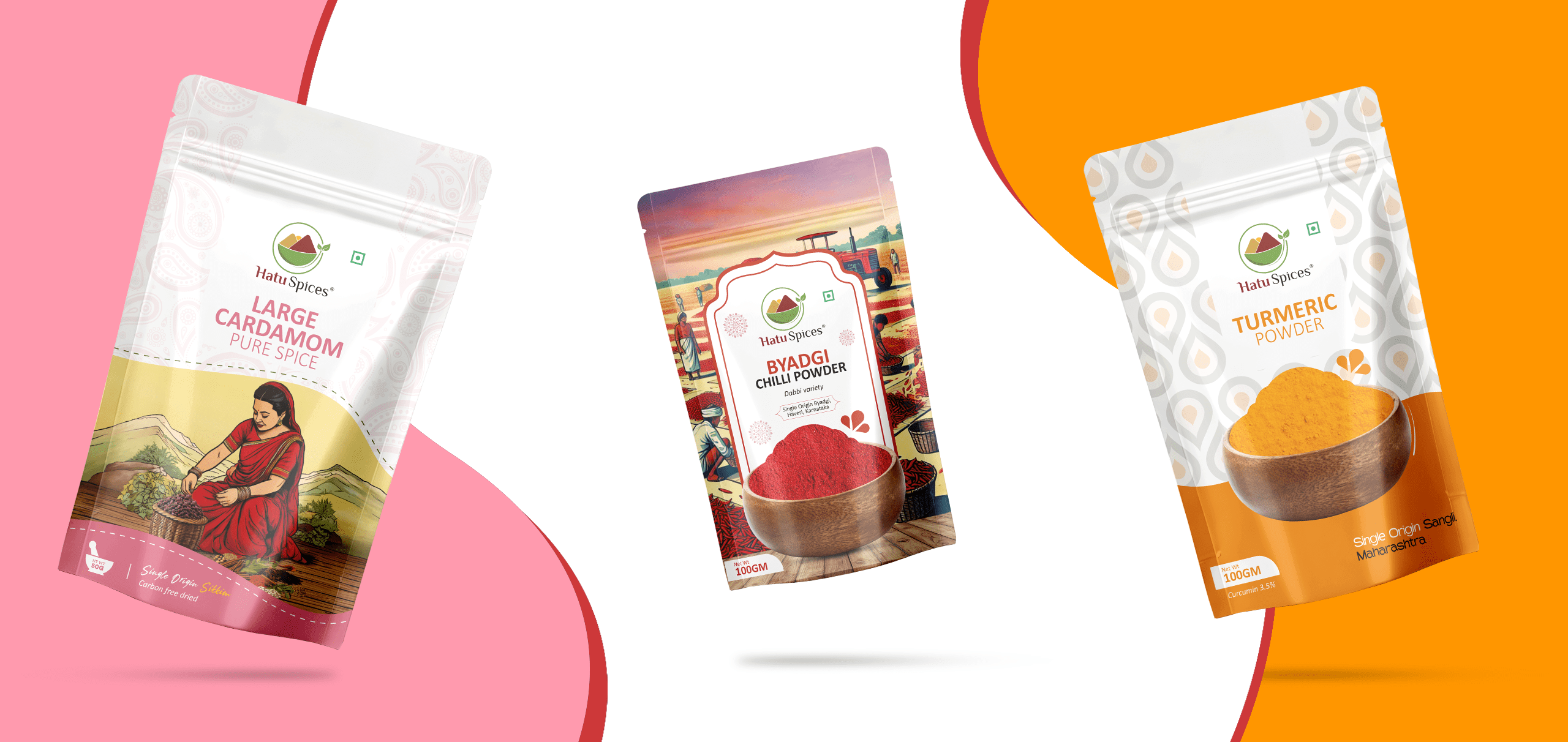
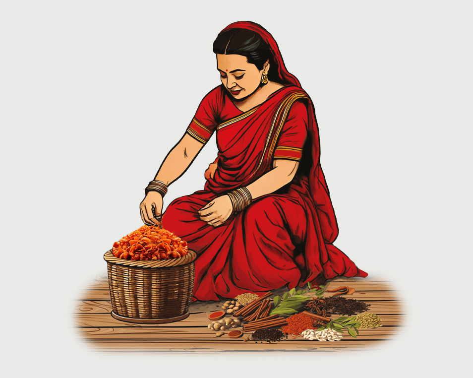
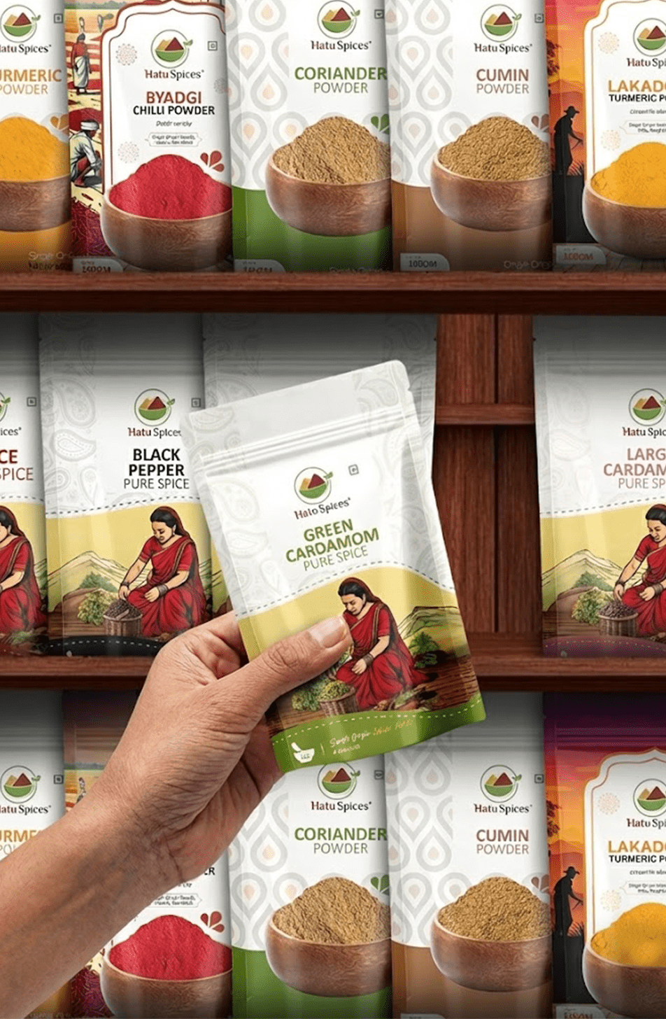
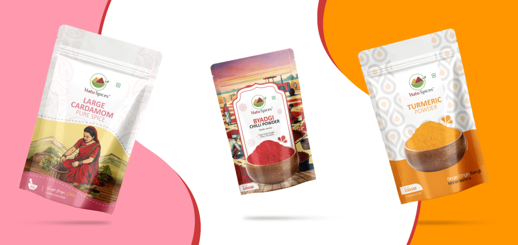
A modern, timeless brand with strong customer acceptance. The signature lady figure in
the packaging became an emblem of authenticity, instantly recognisable and deeply rooted in
where Hatu's spices truly come from.
The comprehensive initiative, extending beyond visual changes, resonated authentically with the audience, resulting in heightened engagement metrics and a tangible boost in sales. The company now stands on a more robust foundation, embodying a stronger and more compelling brand presence, setting the stage for continued success in the competitive market.
Crafting intricate brand narratives for lasting and meaningful impact.
Good design doesn't shout premium…it makes you feel it. With Hatu, we let the origin Speak.